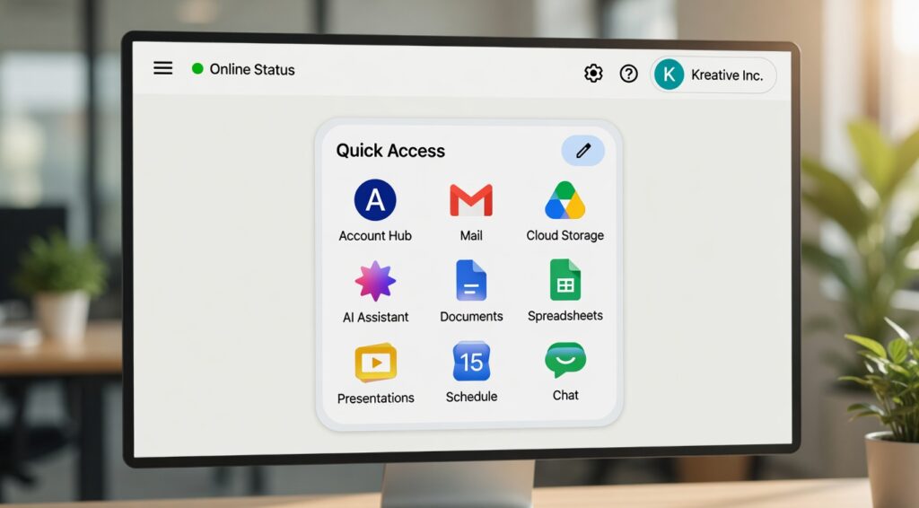
Google has officially introduced newly redesigned gradient Workspace icons across its platform, giving major apps like Gmail, Google Drive, Docs, Sheets, Calendar, Meet, and Keep a fresh and modern visual makeover.
The makeover follows the company’s new AI-focused branding strategy and represents one of the largest design changes in Google Workspace’s history.
The updated symbols are currently visible on Google products’ web versions, and they should soon be available on iOS and Android smartphones. Some users are still getting used to the new layout, while others adore the more contemporary and tidy appearance.This essay will examine the reasons for Google’s Workspace icon changes, the significance of the new gradient design, user reactions, and the implications of this shift for Google’s ecosystem going forward.
Google Workspace Takes on a New Look
For many years, Google Workspace has used vibrant app icons. The older symbols, however, were criticised by many users for being too similar and making it challenging to instantly recognise apps.
Google’s new makeover introduces gradient-based icons with gentler transitions, distinct forms, and cleaner graphics in place of the flat four-color design system. The change is part of Google’s larger initiative to develop a more contemporary and AI-driven visual identity, according to several publications. (Theverge.com)
The revised icons now include:
Colour effects with gradients
corners that are rounded
App symbols that have been simplified
More unique app identities
A more tidy appearance
Improved compatibility with Google’s AI branding
Applications like Gmail, Calendar, Drive, Docs, Sheets, and Slides have already undergone this revamp.
Google Redesigned Workspace Icons: Why?
Because numerous apps used the same combination of red, green, yellow, and blue, Google’s prior Workspace icons drew criticism. Because the icons were almost identical, users frequently opened the incorrect program.
The goal of the new design is to address that problem.
Google is now concentrating on making app icons that are easier to recognise while upholding a standard design language throughout its ecosystem. According to reports, the gradient style also relates to Google’s increasing focus on AI-powered Workspace features and products like Gemini.
Principal Motives for the Redesign
1. Improved Visual Identification
It is now simpler to differentiate between the modified icons. Stronger individual colours and more distinctive forms are increasingly used in apps like Calendar, Meet, and Chat.
2. The Language of Modern Design
In contemporary UI and app design, gradient logos are growing in popularity. Workspace seems to be in line with current design trends, according to Google.
3. AI Branding Approach
Google’s revised “G” logo and Gemini branding are similar to the new gradient look. This denotes Google’s shift to an ecosystem that prioritises AI.
4. Enhanced User Experience
Usability is enhanced by distinctive app icons, particularly for users who manage several Google Workspace apps on a regular basis.
Which Google Workspace Apps Now Use New Icons?
During this release, new gradient icons are being added to a number of Google Workspace apps.
Gmail
Gmail maintains its recognisable “M” design, but it now looks cleaner and has smoother gradient transitions.
Google Drive
One of the most significant cosmetic changes is in Google Drive. The revised icon has smoother gradients with softened edges in place of the previous red accent.
Google Schedule
The calendar is now simpler to recognise right away because it looks more blue-focused.
Google Sheets, Slides, and Docs
In order to better mimic real-world usage, these programs adopt a landscape-style look while keeping familiar colours.
Google Meet
Meet undergoes a dramatic makeover with a more contemporary, gradient-heavy style. Google Store
One of the most contentious modifications is the redesign of Google Keep. A streamlined lightbulb icon has taken the place of the previous yellow note-style design.
Google Tasks and Chat
The single-color design in both apps is now crisper and more noticeable.
Google's New Gradient Icons and User Reactions
As can be expected, there are differing views on the redesign on the internet.
The updated look and better app differentiation are appreciated by some users. Some people think the previous icons were more iconic and simpler to identify.
Users debate whether the revamp is an upgrade or just another needless visual tweak in numerous Reddit and tech forum debates.
Positive Reactions
Supporters of the revamp point out:
Improved app distinction
A more contemporary and tidy appearance
Greater expertise in branding
App launchers that are easier to read
Improved compatibility with Material You and Android 16
Adverse Reactions
The redesign’s detractors claim:
Gradients appear excessively ostentatious.
Certain icons have lost their original meaning.
The Workspace branding seems uneven, and the new Keep icon is more difficult to identify.
Many experts think users will eventually get used to the new look, just as they did with earlier redesigns, despite the conflicting responses.
How Google's AI Future Is Reflected in the New Workspace Icons
The redesign’s relationship to artificial intelligence is among its most significant features.
Almost all of Google’s products, including Gmail, Docs, Sheets, Search, and Android, have lately included AI functionality. All AI-powered experiences seem to be intended to be unified under a single contemporary identity by the new gradient visual language.
The gradient effect can already be seen in:
Google Photos and Gemini
Maps on Google
Branding for Google Search
Workspace tools driven by AI
This visual change is more than just a cosmetic tweak, according to industry analysts. It indicates Google’s long-term plan to present Workspace as an AI-powered intelligent productivity tool.
What This Signifies for Users of Google Workspace
The revamp may seem strange at first to frequent users. But over time, the revised icons are meant to enhance usability and navigation.
Advantages for Users: Simpler App Recognition
Apps are easier to find quickly when they have more distinctive designs and colours.
A Cleaner Work Environment
Enhanced Consistency Across Platforms
Google is developing a consistent visual design for its web, Android, ChromeOS, and next AI products.
Increased Accessibility
For people who struggle with visual processing, more identifiable visual components can enhance usability.
When Will the New Google Workspace Icons Be Available?
Google’s web services are currently gradually implementing the updated gradient iconography. According to reports, the update might soon be available for iOS and Android apps.
Currently, consumers are mostly noticing changes in:
Launcher for Google apps
The new tab page in Chrome
Web apps for workspaces
A few product pages on Google
In future app releases, mobile app icons might be updated.
Wider availability is anticipated during and after Google I/O 2026, however Google has not yet disclosed a precise global rollout schedule
The Online Significance of This Google Update
The updated Workspace icons are already starting to gain popularity in the design and technology sectors.
searches for phrases such as:
“Google updated Workspace icons”
“2026’s new Gmail icon”
“Gradient icons for Google”
“Redesign of Google Workspace”
“Google app icon update”
are growing quickly.
This makes the subject worthwhile for:
Blogs about technology
Websites for graphic design
Android news websites, SEO publishers, and conversations on AI and branding
High search interest and increasing user curiosity can be advantageous for content producers covering Google Workspace upgrades.